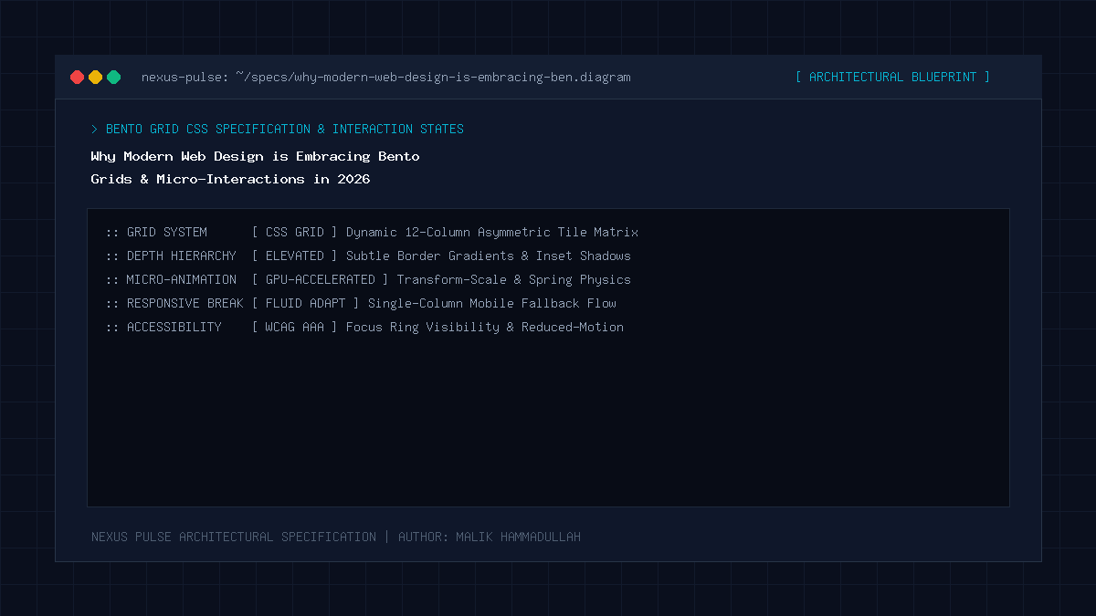
Bento Grids organize disparate content cards of varying visual weights into a structured, responsive mosaic inspired by traditional Japanese lunchboxes, maximizing visual hierarchy and scannability while micro-interactions provide tactile, responsive feedback that boosts reader dwell time.
Key Takeaways & Quick Summary
- Bento Grids eliminate the monotony of uniform, repetitive 3-column card layouts.
- Visual hierarchy is established by allocating larger grid spans to flagship stories and metrics.
- CSS Subgrid allows nested cards to align typography, badges, and CTAs across tracks flawlessly.
- Subtle micro-animations (sub-200ms cubic-bezier transitions) feel snappy and premium without causing distraction.
The Death of the Generic 3-Column Card Layout
For over a decade, web design was trapped in a dull, formulaic template: a full-width hero header followed by endless, uniform rows of three identical white rectangular cards. Regardless of whether a card contained a monumental architectural announcement, a minor bug fix, or a customer testimonial, every element was afforded the exact same physical visual weight.
This monotony induced severe reader fatigue, causing visitors to scan past critical information. In 2026, the global web design landscape has completed a massive aesthetic revolution: the universal adoption of the Bento Grid.
Pioneered by Apple’s hardware presentation slides, popularized by Linear, and perfected by modern publications like NEXUS PULSE and The Verge, Bento Grids arrange multi-dimensional information into an asymmetrical, harmonious mosaic that feels tactile, modern, and engaging.
The Anatomy of a High-Converting Bento Grid
Inspired by traditional Japanese bento lunchboxes that neatly separate rice, protein, and vegetables into compartmentalized portions, a digital Bento Grid groups related modules into distinct visual containers of varying aspect ratios.
A flagship investigative report receives a large 2×2 hero card equipped with dynamic background ambient glow, high-contrast typography, and an interactive read-time pill tag. Adjacent secondary analyses occupy 1×1 compact cards, while quick market metrics or newsletter subscription forms nest into wide 2×1 horizontal slices.
This asymmetrical balance establishes an effortless natural visual hierarchy: the human eye instantly understands where the most important story resides without needing explicit instructions.
Engineering Bento Grids with Modern CSS Subgrid
Implementing Bento Grids historically required fragile JavaScript masonry libraries that caused layout shifts and degraded Core Web Vitals. In 2026, modern CSS Grid paired with `grid-template-columns: repeat(auto-fit, minmax(…))` and `subgrid` makes Bento layouts completely native, lightweight, and performant.
By declaring `grid-template-rows: subgrid` on child card components, headers, content excerpts, and footer metadata badges automatically align across row tracks, ensuring pixel-perfect alignment across varied viewport dimensions without brittle manual height calculations.
Mobile responsiveness is built into the foundation: on smartphone screens, the multi-column mosaic gracefully reflows into a focused, single-column vertical feed with zero horizontal overflow.
The Psychology of Tactile Micro-Interactions
A static layout feels dead; an interface with subtle micro-interactions feels alive and responsive. When a reader hovers over a Bento card, subtle micro-animations—such as a 4-pixel elevation lift (`translateY(-4px)`), a smooth border-color gradient transition, and an ambient box-shadow expansion—provide immediate tactile feedback.
The key to luxury web design is subtlety: micro-interactions must execute with snappy durations (150ms to 250ms) using custom cubic-bezier easing curves (`cubic-bezier(0.16, 1, 0.3, 1)`). Overly aggressive bouncing animations distract readers; restrained, physics-based micro-interactions convey premium craftsmanship.
Why Modern Web Design is Embracing Bento Grids & Micro-Interactions in 2026: Architecture & Technical Specifications Matrix
Traditional Web Card Layouts vs Modern Bento Grids (UX Performance Matrix):
| Design Attribute | Traditional 3-Column Layouts | Modern Bento Grid Layouts (2026) |
|---|---|---|
| Visual Hierarchy | Flat, uniform, and boring (All cards equal weight) | Dynamic, weighted visual storytelling |
| User Dwell Time | Low (Readers scan past repetitive blocks) | High (Engages curiosity across varied card sizes) |
| Information Density | Rigid (Forces identical content lengths) | Flexible (Accommodates charts, pills, and text) |
| Implementation Technology | Legacy float / basic flexbox wrappers | Modern CSS Grid & CSS Subgrid |
| Brand Perception | Generic, cookie-cutter WordPress template | State-of-the-art, custom luxury engineering |
Official Specifications & Primary Sources
Architectural specifications, model capabilities, and benchmark evaluations in this guide are cited from official documentation and published papers (verified as of October 2026):
- MDN: MDN Web Docs: CSS Grid Layout Architecture
- Apple: Apple Human Interface Guidelines: Layout & Grid System
Why Modern Web Design is Embracing Bento Grids & Micro-Interactions in 2026: Engineering Questions & Practical Considerations
Are Bento Grids fully responsive on mobile devices?
Yes. When implemented with CSS Grid, Bento Grids automatically collapse into a sleek, touch-friendly vertical stack on screens narrower than 768px with zero layout breakages.
Do Bento Grids slow down website page speed?
No. Because modern Bento Grids are built with pure vanilla CSS Grid and standard HTML semantic tags, they require zero external JavaScript libraries and achieve instantaneous rendering.
Why do tech companies like Apple and Stripe love Bento Grids?
Because they allow companies to showcase complex hardware specs, software features, and testimonials simultaneously in an organized, visually stunning layout that users love exploring.
Join Our Official WhatsApp Channel
Get instant notifications for breaking AI developments, developer security guides, and tech intelligence directly on WhatsApp.

Recommended Reading