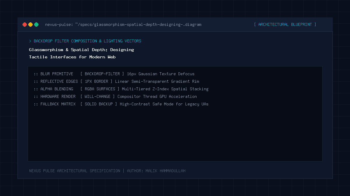
Modern glassmorphism combines translucent background surfaces (RGBA/HSLA), frosted-glass blur effects (`backdrop-filter: blur()`), subtle multi-layered drop shadows, and 1-pixel iridescent borders to create tangible spatial depth and tactile physical realism across web applications.
Key Takeaways & Quick Summary
- Flat design has evolved into dimensional design: interfaces now convey clear spatial elevation hierarchies.
- CSS backdrop-filter blur creates an illusion of frosted glass that adapts dynamically to background content.
- One-pixel translucent borders simulate physical light refraction along the bevel edge of glass sheets.
- Enforcing GPU compositing via `will-change: transform` guarantees smooth 60fps scrolling performance.
The Evolution Beyond Flat Minimalism
For nearly a decade, digital user interface design was dominated by radical flat minimalism. Skeuomorphism—the design philosophy that attempted to mimic physical textures like leather and wood in early iOS interfaces—was aggressively banished in favor of solid color rectangles, zero shadows, and two-dimensional flatness.
While flat design brought much-needed simplicity, it eventually led to a sterile, boring internet where users struggled to identify interactive affordances. Everything looked flat, lifeless, and clinical.
In 2026, the pendulum has settled on a sophisticated synthesis: dimensional glassmorphism. Inspired by optical physics and operating systems like Apple macOS Sonoma and VisionOS, glassmorphism introduces spatial depth, translucency, and light refraction without returning to tacky skeuomorphic kitsch.
The Four Pillars of Modern Glassmorphism
True luxury glassmorphic design requires master of four interconnected visual properties:
Translucency: The background surface must utilize semi-transparent RGBA or HSLA values (e.g., `rgba(15, 23, 42, 0.75)`), allowing underlying shapes and colors to subtly bleed through.
Frosted Blur (`backdrop-filter`): Applying hardware-accelerated Gaussian blur (`backdrop-filter: blur(16px) saturate(180%)`) diffuses the background elements, ensuring that overlaid text remains razor-sharp and effortlessly readable.
Refraction Borders: A 1-pixel semi-transparent border (`border: 1px solid rgba(255, 255, 255, 0.12)`) simulates the physical edge of a glass pane catching ambient overhead light.
Spatial Shadow Elevation: Soft, multi-layered box shadows establish clear z-axis altitude above the underlying content canvas.
Performance Engineering & GPU Hardware Acceleration
Early implementations of `backdrop-filter: blur()` suffered from severe browser frame drops and stuttering on low-powered mobile devices. Because calculating real-time Gaussian blurs on large viewport areas is computationally expensive, careless implementation can degrade scrolling performance.
Modern CSS engineers prevent repaint penalties by isolating glassmorphic elements into their own dedicated GPU compositing layers using `transform: translateZ(0)` or `will-change: transform`.
Furthermore, avoiding nested backdrop-filter containers inside continuous scroll feeds ensures that scrolling remains locked at a silky 60 to 120 frames per second on mobile devices.
Tactile Hover States & Physical Realism
Glassmorphism reaches its full potential when paired with tactile hover interactions. When a user’s cursor enters a glass card, smoothly transitioning the border opacity from 12% to 25% and slightly boosting the ambient box-shadow creates an irresistible physical sensation of touching a real, polished pane of luminous glass.
This tactile feedback transforms a passive reading experience into an engaging, interactive journey.
Glassmorphism & Spatial Depth: Architecture & Technical Specifications Matrix
Flat Design vs Neumorphism vs Modern Glassmorphism (UI Paradigm Comparison):
| Design Paradigm | Visual Characteristics | Accessibility & Legibility | Performance Impact |
|---|---|---|---|
| Flat Design (2014-2020) | Zero shadows, solid flat colors, 2D appearance | High contrast but poor tactile affordance | Extremely lightweight |
| Neumorphism (2020-2022) | Soft extruded plastic shadows (Same color as BG) | Terrible accessibility (Fails WCAG contrast) | Medium performance |
| Glassmorphism (2026) | Translucent frosted glass, refraction borders, depth | Excellent (High text contrast over blurred BG) | High performance via GPU compositing |
Official Specifications & Primary Sources
Architectural specifications, model capabilities, and benchmark evaluations in this guide are cited from official documentation and published papers (verified as of October 2026):
- MDN: MDN Web Docs: backdrop-filter CSS Property
- Apple: Apple HIG: Spatial Materials and Visual Depth
Glassmorphism & Spatial Depth: Engineering Questions & Practical Considerations
Does backdrop-filter work across all modern web browsers?
Yes. In 2026, `backdrop-filter` is universally supported with 99%+ global browser coverage across Safari, Chrome, Edge, and Firefox.
How do I maintain accessibility with glassmorphic cards?
Always ensure the text sitting on top of the glass card has at least a 7:1 contrast ratio against the translucent background, and use `saturate()` and `blur()` to prevent high-contrast background images from interfering with text.
Why do luxury tech websites use glassmorphism?
Because translucent, light-refracting surfaces convey physical craftsmanship, sophistication, and futuristic high-tech aesthetics that flat solid colors cannot replicate.
Join Our Official WhatsApp Channel
Get instant notifications for breaking AI developments, developer security guides, and tech intelligence directly on WhatsApp.

Recommended Reading