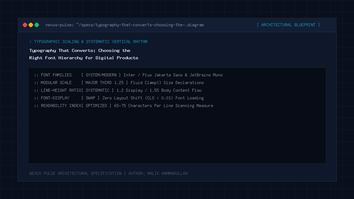
High-converting digital typography combines geometric sans-serif headings with high-legibility grotesque body typefaces, using mathematical fluid scaling (CSS clamp()), optimal line-height geometry (1.6 to 1.7), and 65-character line lengths to eliminate cognitive fatigue and maximize reader engagement.
Key Takeaways & Quick Summary
- Typography accounts for over 95% of the information conveyed across web interfaces.
- Fluid typography using CSS clamp() scales font sizes smoothly between mobile and 4K desktop screens without media query breakpoints.
- Ideal body line length is strictly 60 to 75 characters per line (CPL); lines that are too wide cause readers to lose their place.
- Modern variable fonts reduce HTTP font file payload sizes by 70% while supporting continuous weight interpolation.
Typography as the Invisible Interface
In web design, there is a timeless axiom formulated by pioneering typographer Oliver Reichenstein: “Web design is 95% typography.” Every conversion, product purchase, technical insight, and article share is mediated through the shapes, spacings, and rhythms of digital text characters.
Yet, inexperienced developers frequently treat typography as an afterthought: selecting random font pairings from Google Fonts, hardcoding pixel sizes with arbitrary media queries, and neglecting line-height geometry. The result is an interface that feels subconscious jarring, fatiguing, and difficult to read.
In 2026, leading technical publications engineer typographic hierarchies with the same mathematical precision applied to database indexing and API latency.
The Mathematical Foundation: Fluid Typography with CSS clamp()
Gone are the days of authoring ten disjointed CSS media queries to resize headings from mobile to tablet to desktop. Modern typographic systems utilize fluid type scales powered by the CSS `clamp()` mathematical function.
By declaring `font-size: clamp(2.2rem, 1.6rem + 2.5vw, 3.8rem)` on an `
` heading, the typography scales dynamically and proportionally with the user’s viewport width. On an iPhone screen, the headline fits gracefully without awkward word wrapping; on a 32-inch 4K Studio Display, it expands with commanding visual presence.
This mathematical continuity preserves visual harmony across thousands of disparate device viewports.
Line Length & Reading Ergonomics (The 65-Character Rule)
One of the most catastrophic typographic mistakes on technical blogs is allowing text lines to stretch across the full width of widescreen monitors. When a text line exceeds 85 characters, the human eye struggles to track from the end of one line back to the beginning of the next, causing cognitive friction and high bounce rates.
The optimal typographic measure for reading comprehension is strictly 60 to 75 characters per line (including spaces). Setting `max-width: 68ch` on reading article body containers constrains the reading column to the scientifically proven golden ratio of human visual tracking.
Paired with a line-height (leading) of 1.65 to 1.75 on body paragraphs, text feels open, breathing, and effortless to read.
Font Pairing & Variable Font Optimization
High-performing technical publications establish clarity by pairing a high-personality heading typeface (such as Outfit, Space Grotesk, or Syne) with a workhorse, hyper-legible body typeface (such as Inter, Plus Jakarta Sans, or Roboto).
By deploying modern Variable Fonts (`font-variation-settings`), developers replace four separate font files (Regular, Medium, SemiBold, Bold) with a single, highly compressed WOFF2 asset. This reduces HTTP font payload sizes by over 70%, boosting Core Web Vitals and eliminating First Contentful Paint font layout shifts.
Typography That Converts: Architecture & Technical Specifications Matrix
Typographic Hierarchy & Token Scale Specifications for Technical Blogs:
| Hierarchical Element | Recommended CSS Font Scale | Line Height (Leading) | Font Weight | Optimal Tracking (Letter-Spacing) |
|---|---|---|---|---|
| H1 Page Headline | clamp(2.4rem, 4vw, 3.8rem) | 1.15 to 1.2 | 700 – 800 (Bold/Heavy) | -0.03em (Tightened) |
| H2 Section Heading | clamp(1.6rem, 2.5vw, 2.2rem) | 1.25 to 1.3 | 600 – 700 (SemiBold) | -0.02em (Slightly tight) |
| H3 Sub-Section | clamp(1.25rem, 1.8vw, 1.5rem) | 1.35 to 1.4 | 600 (SemiBold) | -0.01em |
| Body Text (P) | 1.05rem – 1.125rem (17-18px) | 1.65 to 1.75 | 400 (Regular) | 0 (Natural) |
| Caption / Metadata | 0.85rem – 0.88rem (13-14px) | 1.4 to 1.5 | 500 (Medium) | +0.02em (Opened slightly) |
Official Specifications & Primary Sources
Architectural specifications, model capabilities, and benchmark evaluations in this guide are cited from official documentation and published papers (verified as of October 2026):
- Google: Google Fonts Knowledge Base & Typographic Hierarchy
- Butterick’s: Butterick’s Practical Typography Guidelines
Typography That Converts: Engineering Questions & Practical Considerations
What is the best font pairing for a tech blog?
A fantastic modern pairing is Outfit (for sleek, modern geometric headings) paired with Inter or Plus Jakarta Sans (for hyper-legible, pixel-perfect body text).
Why should body font size be at least 17px or 18px?
Because modern smartphone and high-DPI desktop screens have high pixel densities. 14px text forces users to squint and causes eye strain, while 17-18px text provides effortless reading comfort.
What does font-display: swap do in CSS?
It instructs the browser to immediately display text using a system fallback font while the custom web font is downloading, eliminating blank invisible text during page loading.
Join Our Official WhatsApp Channel
Get instant notifications for breaking AI developments, developer security guides, and tech intelligence directly on WhatsApp.

Recommended Reading